General
IntroductionGetting startedWriting MDXBuilt-in componentsDocument settingsDeploying your docsUsage in monorepoUsage with CSS PreprocessorsUsage with TypeScriptCustomizing
Powered by GatsbyGatsby ThemeReferences
Migration GuideProject ConfigurationComponents & Hooks APICreating PluginsMDX PluginsGatsby Theme
If you want to use Docz in a Gatsby application, you can use gatsby-theme-docz.
Gatsby themes is one of the coolest features of all time in Gatsby. With the introduction of theming in Gatsby, it's easier than ever to get started building a Gatsby site. Shared functionality, data sourcing, and design can all be prepackaged as a Gatsby Theme that's an NPM install away.
Our theme has all components and algorithms used to render your documentation website, with it we can explore a lot of Gatsby features and put all this things together in order
to create a really useful documentation website.
With gatsby-theme-docz you can get the full power of docz in your existing Gatsby app.
If you're not sure what a Gatsby theme is, please read the official docs
How to use
First, install some packages:
yarn add gatsby gatsby-theme-docz@next docz@next react react-dom
Then set the gatsby-theme-docz in the plugins option inside your gatsby-config.js
// gatsby-config.js
module.exports = {
  plugins: ['gatsby-theme-docz']
}
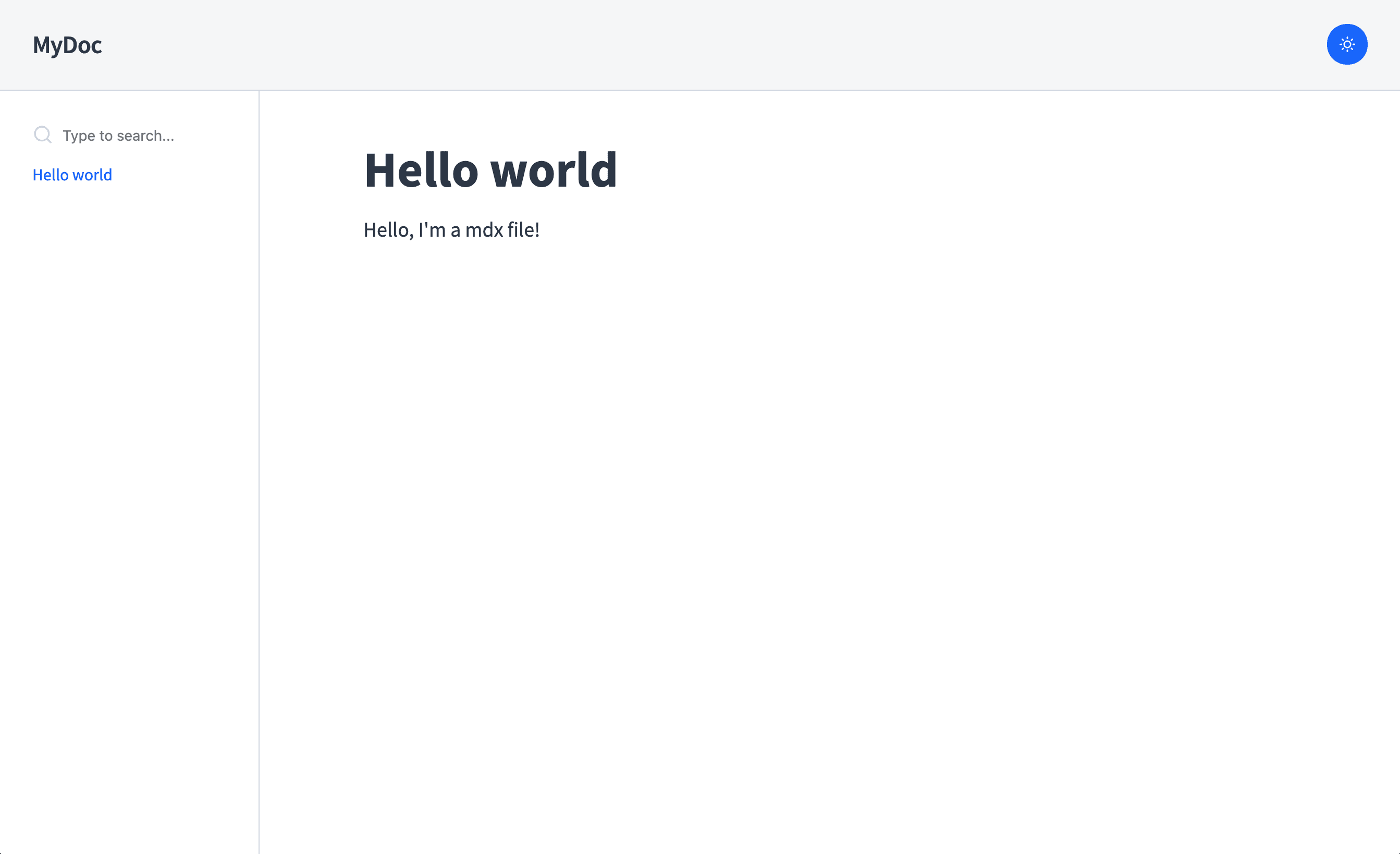
Then, add some .mdx in your project:
---
name: Hello world
route: /
---

# Hello world

Hello, I'm a mdx file!
Now just run gatsby in development mode:
$ yarn gatsby develop
If everything works, you should see something like this:
Configuration
Set your config by using doczrc.js file (see all available) or if you want to
set some defaults for your theme, use options in the plugin definition:
// gatsby-config.js
module.exports = {
  plugins: [
    {
      resolve: 'gatsby-theme-docz',
      options: {
        /* your custom options */
      },
    },
  ],
}
We highly recommend that you set your configuration using
doczrc.jsbecause of live reload that will change in real time your project settings, if you set your configs using the theme definition you will need to reset your dev server in order to see your changes.
Dark Mode
To set the dark version as default, just set your doczrc.js like that:
// doczrc.js
export default {
  themeConfig: {
    initialColorMode: 'dark',
  },
}
Customizing components
Components shadowing is one of the best things included in the new Gatsby theme feature, with it, it is possible to replace theme files just by creating your own file following a file naming convention.
Example: If you're using our gatsby-theme-docz which has a Header component located at src/components/Header/index.js you can override the component by creating src/gatsby-theme-docz/components/Header/index.js. Cool right?
Adding your logo
So, now that you know about how component shadowing works on Gatsby themes, if you don't want to override the entire <Header> component but just change your logo inside it, your can shadow the <Logo> component used in the header just by creating your own at src/gatsby-theme-docz/components/Logo/index.js
// src/gatsby-theme-docz/components/Logo/index.js
import React from 'react'
import logo from './logo.svg'

export const Logo = () => <img src={logo} alt="That's my logo" />
Easy, right?
Creating your own Docz theme
One of the coolest thing of Docz is that you can create your own theme if you want from scratch and keep all docz's benefits.
Previously, this was accomplished by using the theme property inside the doczrc.js file.
Starting from v2, if you want to create your own theme, just create a file located at src/gatsby-theme-docz/index.js
import React from 'react'
import { theme, useConfig, ComponentsProvider } from 'docz'
import { ThemeProvider } from 'theme-ui'
import baseComponents from 'gatsby-theme-docz/src/components'

import { Menu } from './MyBeautifulMenu'

const componentsMap = {
  ...baseComponents,
  /* your custom components */,
}

const Theme = ({ children }) => {
  const config = useConfig()
  return (
    <ThemeProvider theme={config}>
      <Menu />
      <ComponentsProvider components={componentsMap}>
        {children}
      </ComponentsProvider>
    </ThemeProvider>
  )
}

const themeConfig = {
  colors: {
    primary: 'tomato',
    secondary: 'khaki',
    gray: 'lightslategray',
  },
}

export default theme(themeConfig)(Theme)
More info about here
Wrapping the entire app
Sometime you need to wrap your entire application in order to add some Provider or just to load some script. You can do this easily inside our theme by creating a file located at src/gatsby-theme-docz/wrapper.js
// src/gatsby-theme-docz/index.js
import React from 'react'

export default ({ children }) => (
  <div>
    <h1>My custom wrapper</h1>
    {children}
  </div>
)
Theme UI integrated
Docz's code uses Theme-UI as the default theme system.
Theme-UI is a library for building consistent, themeable React apps based on constraint-based design principles.
You can modify the default theme and create your own style by combining these modifications with component shadowing.
Check our base theme object to see the properties.
To create your own theme definition use the doczrc.js and set your properties in the themeConfig like that:
// doczrc.js
export default {
  themeConfig: {
    colors: {
      header: {
        bg: 'tomato',
      },
    },
  },
}
Or, to create your own theme, just create this file in the root of your project: src/gatsby-theme-docz/theme/index.js.
import baseTheme from 'gatsby-theme-docz/src/theme/index'
import { merge } from 'lodash/fp'

export default merge(baseTheme, {
  colors: {
    header: {
      bg: 'tomato',
    },
  },
})
Changing code highlight
Both code highlights shortcodes and the <Playground> component use prism-react-renderer to highlight the code.
If you want to modify and use another PrismJS theme, you can do that just passing a prismTheme property for your theme.
// doczrc.js
import myCustomPrismTheme from './my-prism-theme'

export default {
  themeConfig: {
    prismTheme: myCustomPrismTheme,
  },
}
Or you want to have different themes for light and dark color mode, you can change the prism default property like that:
// doczrc.js
import customLightTheme from './my-light-theme'
import customDarkTheme from './my-dark-theme'

export default {
  themeConfig: {
    prism: {
      light: customLightTheme,
      dark: customDarkTheme,
    },
  },
}
Adding component shortcodes
You can add shortcodes to your docs site which can be used throughout
your docs pages by extending the components passed to MDXProvider. You
can do this by using component shadowing and creating the following file
in the root of your project: src/gatsby-theme-docz/components/index.js.
Example components.js
import baseComponents from 'gatsby-theme-documentation/src/components'
import MyCustomH1 from '../components/my-custom-h1'

export default {
  ...baseComponents,
  h1: MyCustomH1,
}
Getting data
Using our Gatsby Theme you can use all Gatsby hooks to get data for your pages and from Gatsby. So, you can create isolated pages on Gatsby using gatsby pages and get data from Docz or maybe pass data for your Docz documents using source from gatsby.
Imagine, that you have your home page inside /pages and you want to show all documents parsed from Docz. You can get this by doing:
import React from 'react'
import { useDocs } from 'docz'

const Home = () => {
  const docs = useDocs()
  return (
    <div>{/* my coolest home */}</div>
  )
}

export default Home
Or you can have a mdx document inside Docz that has data from Gatsby too:
---
name: MyDoc
---

import { MyComponentWithSomeData } from './my-component-with-data'

<MyComponentWithSomeData />
Cool right?