General
IntroductionGetting startedWriting MDXBuilt-in componentsDocument settingsDeploying your docsUsage in monorepoUsage with CSS PreprocessorsUsage with TypeScriptCustomizing
Powered by GatsbyGatsby ThemeCreating your themesAdd Favicon and MetadataComponent ShadowingCustomizing Webpack ConfigReferences
Migration GuideProject ConfigurationComponents & Hooks APICreating PluginsMDX PluginsBuilt-in components
Docz has built-in components that help you document your code.
Using the power of components and their parsed ASTs (Abstract Syntax Trees) we can do a lot of things, like render your components, create tables with content describing them, generate documentation from your code, define custom getters by traversing your files and many other things. The sky is the limit here!
Playground Component
With the <Playground> component, you can render your component inside a live-editable playground and directly see the output of the code used:
---
name: Button
route: /
---

import { Playground } from 'docz'
import { Button } from './Button'

# Button

## Basic usage

<Playground>
  <Button>Click me</Button>
  <Button kind="secondary">Click me</Button>
</Playground>
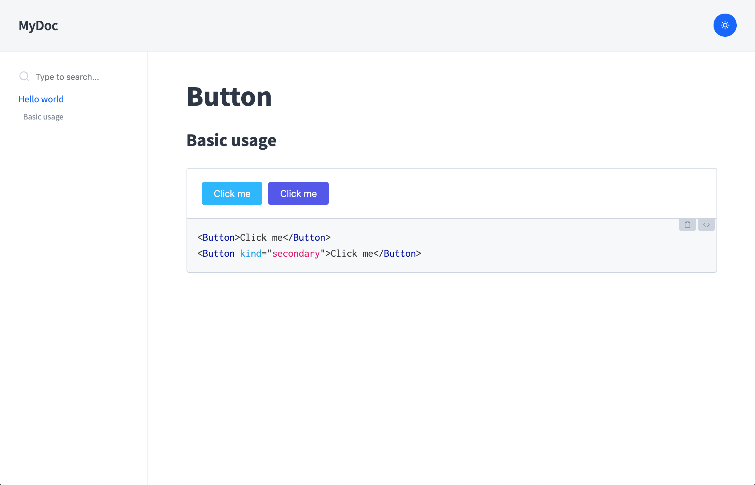
As you can see, <Playground> renders your components, and right below them displays an editable version of the code used.
This can be very useful to test and develop your components in a good environment while also documenting them.
Note that you can edit the code below the components from your browser and see the changes you make be reflected live above it!
Stateful components
The <Playground> component is also able to let you edit stateful and functional components:
import { Playground } from 'docz'

# Counter

<Playground>
  {() => {
    const [counter, setCounter] = React.useState(0)
    return (
      <>
        <button onClick={() => setCounter(counter => counter+1)}>
          Increase
        </button>
        <p>{counter}</p>
      </>
    )
  }}
</Playground>
If you wrap the previous render inside a separate <Counter> component, it becomes:
import { Playground } from 'docz'
import { Counter } from './Counter'

# Counter

<Playground>
  {() => {
    const [counter, setCounter] = React.useState(0)
    return (
      <Counter
        value={counter}
        onChange={() => setCounter(counter => counter+1)}
      />
    )
  }}
</Playground>
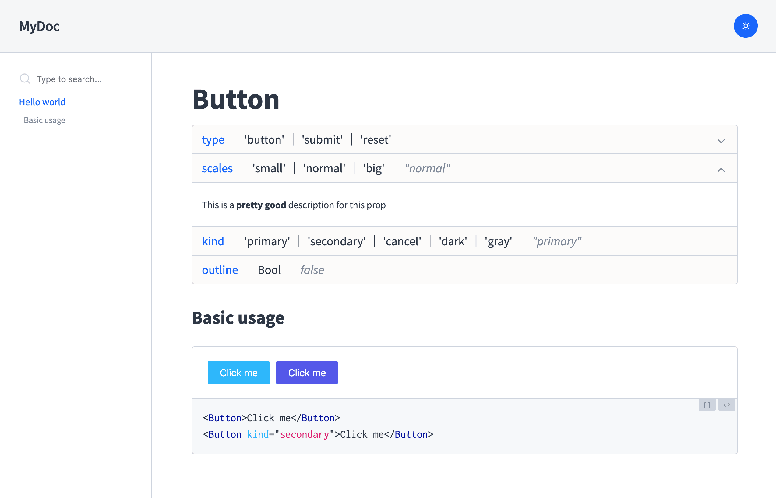
Component Props
One of the most important things when documenting a component is to know which props it expects.
However, keeping a good properties documentation for your component can be difficult and error-prone, because you need to write the props specification and maintain the original props definition separately. This makes it hard to keep them both in sync !
Docz offers a solution to this problem called the <Props> component. It's a component that automatically gets the
props definitions of your component and displays them in a neat table along with their default value and an optional description.
In addition to supporting parsing prop-types in JS code, it works nicely with Flow and Typescript.
---
name: Button
route: /
---

import { Playground, Props } from 'docz'
import { Button } from './'

# Button

<Props of={Button} />

## Basic usage

<Playground>
  <Button>Click me</Button>
  <Button kind="secondary">Click me</Button>
</Playground>
The Button component must have some annotation describing its props.
For non flow or typescript users this can be achieved with prop-types
import React from 'react'
import t from 'prop-types'

const Button = ({ children, kind }) => {
  // We use the kind prop to determine the button's class
  return <button className={kind}>{children}</button>
}

Button.propTypes = {
  /**
   * This is a pretty good description for this prop.
   */
  kind: t.oneOf(['primary', 'secondary', 'cancel', 'dark', 'gray']),
}
Button.defaultProps = {
  kind: 'primary',
}
export Button
If you have used prop-types like described above, you should see a list of properties in a nicely formatted table:
The same can be achieved in typescript by adding comments to the props interface of your component:
import React from 'react'

interface ButtonProps {
  /**
   * This is a pretty good description for this prop.
   */
  kind: 'primary' | 'secondary' | 'cancel' | 'dark' | 'gray'
}
You can read a more in-depth guide about our built-in components in Components API.
And if you prefer to dive deeper into MDX document settings you can head over to Document Settings